Forex Trading Informations

Tuesday, December 20, 2011

Pivot Point Trading by Mark Mc Rae

You are going to love this lesson. Using pivot points as a trading strategy has been around for a long time and was originally used by floor traders. This was a nice simple way for floor traders to have some idea of where the market was heading during the course of the day with only a few simple calculations.
The pivot point is the level at which the market direction changes for the day. Using some simple arithmetic and the previous days high, low and close, a series of points are derived. These points can be critical support and resistance levels. The pivot level, support and resistance levels calculated from that are collectively known as pivot levels.

Every day the market you are following has an open, high, low and a close for the day (some markets like forex are 24 hours but generally use 5pm EST as the open and close). This information basically contains all the data you need to use pivot points.
The reason pivot points are so popular is that they are predictive as opposed to lagging. You use the information of the previous day to calculate potential turning points for the day you are about to trade (present day).
Because so many traders follow pivot points you will often find that the market reacts at these levels. This give you an opportunity to trade.
Before I go into how you calculate pivot points, I just want to point out that I have put an online calculator and a really neat desktop version that you can download for free HERE
If you would rather work the pivot points out by yourself, the formula I use is below:
Resistance 3 = High + 2*(Pivot - Low)
Resistance 2 = Pivot + (R1 - S1)
Resistance 1 = 2 * Pivot - Low
Pivot Point = ( High + Close + Low )/3
Support 1 = 2 * Pivot - High
Support 2 = Pivot - (R1 - S1)
Support 3 = Low - 2*(High - Pivot)

As you can see from the above formula, just by having the previous days high, low and close you eventually finish up with 7 points, 3 resistance levels, 3 support levels and the actual pivot point.
If the market opens above the pivot point then the bias for the day is long trades. If the market opens below the pivot point then the bias for the day is for short trades.
The three most important pivot points are R1, S1 and the actual pivot point.
The general idea behind trading pivot points are to look for a reversal or break of R1 or S1. By the time the market reaches R2,R3 or S2,S3 the market will already be overbought or oversold and these levels should be used for exits rather than entries.
A perfect set would be for the market to open above the pivot level and then stall slightly at R1 then go on to R2. You would enter on a break of R1 with a target of R2 and if the market was really strong close half at R2 and target R3 with the remainder of your position.
Unfortunately life is not that simple and we have to deal with each trading day the best way we can.
I have picked a day at random from last week and what follows are some ideas on how you could have traded that day using pivot points.

On the 12th August 04 the Euro/Dollar (EUR/USD) had the following:
High - 1.2297
Low - 1.2213
Close - 1.2249
This gave us:
Resistance 3 = 1.2377
Resistance 2 = 1.2337
Resistance 1 = 1.2293
Pivot Point = 1.2253
Support 1 = 1.2209
Support 2 = 1.2169
Support 3 = 1.2125
Have a look at the 5 minute chart below
pivot point
The green line is the pivot point. The blue lines are resistance levels R1,R2 and R3. The red lines are support levels S1,S2 and S3.
There are loads of ways to trade this day using pivot points but I shall walk you through a few of them and discuss why some are good in certain situations and why some are bad.
The Breakout Trade

At the beginning of the day we were below the pivot point, so our bias is for short trades. A channel formed so you would be looking for a break out of the channel, preferably to the downside. In this type of trade you would have your sell entry order just below the lower channel line with a stop order just above the upper channel line and a target of S1. The problem on this day was that, S1 was very close to the breakout level and there was just not enough meat in the trade (13 pips). This is a good entry technique for you. Just because it was not suitable this day, does not mean it will not be suitable the next day.
pivt point channel
The Pullback Trade

This is one of my favorite set ups. The market passes through S1 and then pulls back. An entry order is placed below support, which in this case was the most recent low before the pullback. A stop is then placed above the pullback (the most recent high - peak) and a target set for S2. The problem again, on this day was that the target of S2 was to close, and the market never took out the previous support, which tells us that, the market sentiment is beginning to change.
pivot point pullback
Breakout of Resistance

As the day progressed, the market started heading back up to S1 and formed a channel (congestion area). This is another good set up for a trade. An entry order is placed just above the upper channel line, with a stop just below the lower channel line and the first target would be the pivot line. If you where trading more than one position, then you would close out half your position as the market approaches the pivot line, tighten your stop and then watch market action at that level. As it happened, the market never stopped and your second target then became R1. This was also easily achieved and I would have closed out the rest of the position at that level.
pivot point brakeout
Advanced

As I mentioned earlier, there are lots of ways to trade with pivot points. A more advanced method is to use the cross of two moving averages as a confirmation of a breakout. You can even use combinations of indicators to help you make a decision. It might be the cross of two averages and also MACD must be in buy mode. Mess around with a few of your favorite indicators but remember the signal is a break of a level and the indicators are just confirmation.
pivot point advanced
We haven't even got into patterns around pivot levels or failures but that is not the point of this lesson. I just want to introduce another possible way for you to trade.
Good Trading
Best Regards
Mark McRae
Information, charts or examples contained in this lesson are for illustration and educational purposes only. It should not be considered as advice or a recommendation to buy or sell any security or financial instrument. We do not and cannot offer investment advice. For further information please read our disclaimer.
learn to trade
http://www.surefire-trading.com
info@surefire-trading.com

A Different Type of Moving Average Cross by Mark Mc Rae

Virtually every trader has dabbled with or experimented with some sort of moving average.
What I want to introduce you to in this lesson is a different sort of moving average cross method, which I have found to be very good at identifying short term trend changes.
As we know a moving average is normally plotted using the close of a bar e.g. if you were plotting a 3 period moving average, then you would add the last three closes and divide the total by three to get a simple moving average.

This is where I want you to think a little differently. I have always been an advocate of taking traditional thinking and changing it around. What if you used the open instead of the close? What if you used the close of one period of a moving average and the open of another?
First, most charting packages will allow you to use the open, high, low or close to plot a moving average.
moving average cross
In the example below of the daily Dow Jones, I have used a 5 period exponential moving average of the close and a 6 period exponential moving average of the open. As you can see it catches the short term trend changes really nicely.
moving average
In the next example of the 1 hour EUR/USD, you can see that the close/open combination worked really well. Of course you will go through periods of consolidation with any market and any moving average method you use will be whipsawed. To get around this you need some sort of filter or approach that helps you keep out of the low probability trades.
You could use ADX, Stochastic or MACD to help filter the noise but I also like to add a time frame.
clossed crosses
In the next example of the 4 hour GBP/USD you can see that on the 24th September 04 at 4:00 there was a cross of the 5 period exponential moving average of the close above the 6 period exponential moving average of the open. This signal has remained in place until today as I write on the 27th September.
ema moving average
Although there was a signal on the 4 hour, to help identify even better entry points you can drop down a few time frames to the 30 minute chart. As you can see from the 30 minute chart there have been quite a few crosses of the 5 period exponential moving of the close above or below the 6 period exponential moving average of the open.
moving average
There are lots of ways to trade this but a neat little trick is to wait for the signal on a higher time frame and then drop down a few time frames and wait for a pullback. The first signal after the pullback on the lower time frame is normally a pretty good entry point e.g.
If there were a cross up on the large time frame then drop down to a lower time frame and wait for the market to retrace and then give another buy signal (cross up). The opposite is true for short signals.
Once you get the signal on the shorter time frame depending on where support is you can usually place your first stop loss under the nearest support area (valley).

If the market begins to make progress you can move your stop so that it trails the market by moving your stop to just under the most recent support area.
In this lesson I have use an exponential moving average but experiment with different types of average such as weighted, smoothed or simple. You can also experiment with different lengths of moving average.
Good Trading
Best Regards
Mark McRae

Forex and Foreign Exchange - Trading with Strategy

Trading successfully is by no means a simple matter. It requires time, market knowledge and market understanding and a large amount of self restraint. ACM does not manage accounts, nor does it give market advice, that is the job of money managers and introducing brokers.
As market professionals, we can however point the novice in the right direction and indicate what are correct trading tactics and considerations and what is total nonsense.
Anyone who says you can consistently make money in foreign exchange markets is being untruthful.

Foreign exchange by nature, is a volatile market. The practice of trading it by way of margin increases that volatility exponentially. We are therefore talking about a very 'fast market' which is naturally inconsistent. Following that precept, it is logical to say that in order to make a successful trade, a trader has to take into account technical and fundamental data and make an informed decision based on his perception of market sentiment and market expectation. Timing a trade correctly is probably the most important variable in trading successfully but invariably there will be times where a traders' timing will be off. Don't expect to generate returns on every trade.
Let's enumerate what a trader needs to do in order to put the best chances for profitable trades on his side:

Trade with money you can afford to lose:
Trading fx markets is speculative and can result in loss, it is also exciting, exhilarating and can be addictive. The more you are 'involved with your money' the harder it is to make a clear-headed decision. Money you have earned is precious, but money you need to survive shouldnever be traded.


Identify the state of the market:
What is the market doing? Is it trending upwards, downwards, is it in a trading range. Is the trend strong or weak, did it begin long ago or does it look like a new trend that's forming. Getting a clear picture of the market situation is laying the groundwork for a successful trade.


Determine what time frame you're trading on:
Many traders get in the market without thinking when they would like to get out, after all the goal is to make money. This is true but when trading, one must extrapolate in his mind's eye the movement that one expects to happen. Within this extrapolation, resides a price evolution during a certain period of time. Attached to this is the idea of exit price. The importance of this is to mentally put your trade in perspective and although it is clearly impossible to know exactly when you will exit the market, it is important to define from the outset if you'll be 'scalping' (trying to get a few points off the market) trading intra-day, or going longer term.

This will also determine what chart period you're looking at. If you trade many times a day, there's no point basing your technical analysis on a daily graph, you'll probably want to analyse 30 minute or hour graphs. Additionally it is important to know the different time periods when various financial centers enter and exit the market as this creates more or less volatility and liquidity and can influence market movements.

Time your trade:
You can be right about a potential market movement but be too early or too late when you enter the trade. Timing considerations are twofold, an expected market figure like CPI, retail sales or a federal reserve decision can consolidate a movement that's already underway. Timing your move means knowing what's expected and taking into account all considerations before trading. Technical analysis can help you identify when and at what price a move may occur. We will look at technical analysis in more detail later.


If in doubt, stay out:If you're unsure about a trade and find you're hesitating, stay on the sidelines.

Trade logical transaction sizes:
Margin trading allows the fx trader a very large amount of leverage, trading at full margin capacity (in ACM's case 1% or 0.5%) can make for some very large profits or losses on an account. Scaling your trades so that you may re-enter the market or make transactions on other currencies is generally wiser. In short, don't trade amounts that can potentially wipe you out and don't put all your eggs in one basket. ACM offers the same rates regardless of transaction sizes so a customer has nothing to lose by starting small.


Gauge market sentiment:
Market sentiment is what most of the market is perceived to be feeling about the market and therefore what it is doing or will do. This is basically about trend. You may have heard the term 'the trend is your friend', this basically means that if you're in the right direction with a strong trend you will make successful trades. This of course is very simplistic, a trend is capable of reversal at any time. Technical and fundamental data can indicate however if the trend has begun long ago and if it is strong or weak.


Market expectation:
Market expectation relates to what most people are expecting as far as upcoming news is concerned. If people are expecting an interest rate to rise and it does, then there usually will not be much of a movement because the information will already have been 'discounted' by the market, alternatively if the adverse happens, markets will usually react violently.


Use what other traders use:
In a perfect world, every trader would be looking at a 14 day RSI and making trading decisions based on that. If that was the case, when RSI would go under the 30 level, everyone would buy and by consequence the price would rise. Needless to say, the world is not perfect and not all market participants follow the same technical indicators, draw the same trendlines and identify the same support & resistance levels. The great diversity of opinions and techniques used translates directly into price diversity. Traders however have a tendency to use a limited variety of technical tools. The most common are 9 and 14 day RSI, obvious trendlines and support levels, fibonnacci retracement, MACD and 9, 20 & 40 day exponential moving averages. The closer you get to what most traders are looking at, the more precise your estimations will be. The reason for this is simple arithmetic, larger numbers of buyers than sellers at a certain price will move the market up from that price and vice-versa.


Information, charts or examples contained in this lesson are for illustration and educational purposes only. It should not be considered as advice or a recommendation to buy or sell any security or financial instrument. We do not and cannot offer investment advice. For further information please read our disclaimer.
by Nicholas H. Bang
ac-markets.com
www.ac-markets.com
support@ac-markets.com

Why does technical analysis work?

Technical analysis describes different ways of predicting the future of the stock/futures market based on its history. Unfortunately, technical analysis is not an exact science. Many prominent scientists label it as "voodoo science".
They claim that due to market efficiency, if you use TA to find your entry positions, you're no better off than someone who chooses those positions randomly.
Market efficiency means that all the available information is already calculated in the stock prices, and that you can only guess how the price will behave in the future.

The "voodoo science" theory would make sense if it wasn't for the fact that there is a significant number of traders who are able to consistently make profits in the stock/futures market. These traders use technical analysis as their main tool. Since any trader has or can have access to the same TA tools we have to ask how can a small group of traders consistently win and the other larger group, more or less consistently lose in the stock market game. What is it that winning traders know about technical analysis that gives them the upper hand?
The answer is simple: Technical Analysis works but not necessarily for the reason most people believe. Many successful traders don't want to share this secret. TA works because many people use it, and successful traders are able to predict how other people will react on the different TA indicators and signals. In other words, while the losing traders are using TA to determine their trades, the winning traders are winning because they know how the losers are going to react based on this data. For example, when a price goes below one of the key moving averages, (MA's) many investors sell that instrument to protect themselves against additional losses. By doing so, they will drive the price of that instrument lower and that will prompt some traders to start short selling that instrument in anticipation of further decline. Prices continue the downward trend, forcing traders who were long on that stock to sell their positions because it is going below their stop limits. This creates a domino effect as the price continues to decline. However, at this point, successful traders realize that most of the current price action was created artificially. They start to enter positions on the buy side and more often than not price starts to reverse. The losing traders have already sold their contracts based on the TA tools. The winning traders buy the contract because they understand that the fluctuation was temporary, and they seize the opportunity based on the losing trader's reactions.
No TA tool by itself will give you reliable buy or sell signals. There is no Holy Grail or magic black box that will give you the perfect, accurate signal. However, the combining of the right group of TA indicators with discipline and adequate trading capital has been the road to fortune for many traders. There is no reason why you cannot emulate their success. Let's take a look at an example.

Understanding Pivot Points
Pivot Points are those price levels that are most likely to act as levels of support and resistance on any given trading day. As we already know, Technical Analysis works because many people use it.
For the same reason, the most influential pivot points are those that are used by majority of traders.
The most widely used formula for calculating pivot points is as follows:
H = previous day's high
L = previous day's low
C = previous day's close
Pivot Point = (H + L + C)/3
Resistance = 2*PP - L
Support = 2*PP - H
Previous day's last two hour high = L2HrHigh
Previous day's last two hour low = L2HrLow

When the price moves through the known pivot point on increased volume it is most likely to continue current trend, and if the price hits the known pivot point but is unable to move through it is most likely to reverse the current trend.
Figure above is a 5-minute candlestick chart for S&P 500 E-mini contract and you can observe how the Pivot Point was acting as a major support line throughout the trading day.

When the advancing/declining price is not able to move through the known pivot point after two or more tries there is a good probability that it will start to decline/advance. Trading method in which a trader is waiting for a price to reverse after hitting S/R level is called swing trading. On the other hand if the advancing/declining price has easily moved through known S/R level there is a good probability that it will continue to advance/decline. Trading method in which a trader is looking for a price to continue to move in the same direction after moving through S/R level is called breakout trading.


Good Trading
By Zoran Kolundzic
www.eminitradingcourse.com

Point & Figure Charts

Why Point & Figure Charts?
Point & Figure (P&F) charts are one of the simplest and clearest ways to determining the best time to buy and sell shares. The P&F system represents one of the oldest approaches to share market trading.
This method takes the technical analysts approach while monitoring supply and demand for each share.
And the charts are designed for long-term trading so that the time and cost of trading shares is minimal.

How are Point & Figure Charts Constructed?
In P&F charts both axis are dependent on price rather than one being based on price and the other on date. The key unit in a P&F chart is the point, or unit of price. The point size may change in value along the y-axis to provide consistent and relative price movements. This means that a if a share ranges between $8 and $12, the point size may be 10 cents when the share is below $10 and 20 cents when above. An ‘X’ is placed on the chart to indicate an upward movement and an ‘O’ indicates a downward movement. The graph gets its x-axis dimension via three point reversals. A three-point reversal occurs when either:
  1. The price is on a downward trend, then picks up three or more points, or
  2. The price is on an upward trend, then falls by three or more points.
When a three-point reversal occurs, the chart is continued in the next column. Thus every column must contain at least 3 ‘O’s or ‘X’s and constitutes movement in one direction only. The attraction of this method is that insignificant movements in the market are filtered out.
Now, let's look at a typical example (Broken Hill). The point size for these values is 20 cents.
Date
Day
High ($)
Low ($)
10/02/98Tue
15.38
15.00
11/02/98Wed
15.22
14.95
12/02/98Thu
15.01
14.81
13/02/98Fri
14.95
14.35
16/02/98Mon
14.45
14.05
17/02/98Tue
14.39
13.98
18/02/98Wed
14.62
14.31
19/02/98Thu
14.66
14.42
20/02/98Fri
14.40
14.24
23/02/98Mon
14.45
14.32
24/02/98Tue
14.35
13.98
25/02/98Wed
14.22
13.93

The data previous to this showed an upward trend and constituted a series of ‘X’s in the column. This column peaks at $15.38 on 10/02/98. The last ‘X’ is drawn in the $15.20 square because the share has not yet reached $15.40. This means that for a three point reversal to occur the price must drop by at least 60 cents, or three points. This happens on 13/02/98 with a low of $14.35. When this occurs the chart is moved to the next column and ‘O’s are placed in the $15.00, $14.80, $14.60 and $14.40 rows. An ‘O’ is not placed in the $14.20 row because the price has not yet reached $14.20. The price does, however, fall to $14.05 on 16/02/98 and another ‘O’ is place in the $14.20 row. The chart falls once again to $13.98 on 17/02/98. When this occurs yet another ‘O’ is added to the chart, this time in the $14.00 row. The very next day the chart rises to $14.62 and this constitutes a three-point reversal. The chart is moved to the next column and ‘X’s are placed in the $14.20, $14.40 and $14.60 rows. No more ‘X’s are added to this column because the share performs another three point reversal on the 25/02/98 and three ‘O’s are place in the appropriate points in the next column. The chart should now look like the this (first column of chart incomplete):
 
$15.40    
$15.20X
 
  
$15.20 
O
  
$14.80 
O
  
$14.60 OX 
$14.40 
O
X
O
$14.20 
O
X
O
$14.00 O O
$13.80    

Dates are added to the chart by replacing an ‘X’ or an ‘O’ by the month number. When the year changes it is written at the bottom of the chart. You will notice that the year labels can be vary in position as the charts movement is dependent on price and not on date. The suspension of trading on particular shares is shown by a ‘?’ in the charts.
The Wyckoff Method
The Wyckoff method is a special type of point & figure chart. It uses a single box reversal instead of the more common three point reversal. It also varies from the standard point & figure chart because it can contain both X’s and O’s in the same column. This will occur whenever there is only a single entry made in a column. For example if we had a single X in a column followed by 3 O’s, the O’s will be displayed in the same column as the X. In a Wyckoff chart there must always be more than one entry in a column.

Let's take an example. The box size for these values is $1.00. Note that a Wyckoff chart can also use high and low data, but for clarity we have selected closing price data only.
Date
Day
Close
10/02/98Tue55.00
11/02/98Wed57.00
12/02/98Thu56.00
13/02/98Fri57.00
16/02/98Mon58.00
17/02/98Tue59.00
18/02/98Wed56.00
19/02/98Thu57.00
20/02/98Fri56.00
23/02/98Mon57.00
24/02/98Tue56.00

On 11/02/98 the chart rose from $55 to $57. This resulted in 3 X’s being plotted in the first column. The very next day there was a pull back of one box to $56. Because we are using a one point reversal, we move to the next column and plot the single O. The next day the price rises again to $57. This again is a reversal, however we do not move to the next column because we have only made one entry in the current column. The upward movement continues until the chart reaches $59 on 17/02/98. Continuing to plot the data in this fashion will produce the chart below:
$60.00     
$59.00 X   
$58.00 XO  
$57.00XXOXX
$56.00XOOOO
$55.00X    

Other than the two requirements described above, the Wyckoff point & figure chart uses the same principals as a standard three point reversal chart.
When to Buy and Sell
When analysing the charts to determine the best time to buy and sell shares, the following criteria must be evaluated:
  1. Patterns
  2. Trend Lines
  3. Market Indicators
  4. Price Objectives

Point & Figure Patterns
Double Top and Double Bottom Formation
Double Top
Double Bottom
Double Top
Double Bottom
Double Top and Double Bottom formations are the most basic of chart patterns. A Double Top is formed when a high is followed by a decline, which is then followed by a rise that exceeds the previous. A Double Bottom is formed in a similar fashion. As we will see later, most other formations are variations on this simple pattern. Generally, formations that consist of more than 3 vertical columns yield better results.
The Triple Top and Triple Bottom Formation
Triple Top
Triple Bottom
Triple Top
Triple Bottom
This pattern occurs when a series of 2 or more tops or bottoms is penetrated. Generally this is formed by 5 vertical columns, however it is possible for formation to be spread over multiple columns as shown below:
Spread Triple Top
Spread Triple Bottom
Spread Triple Top
Spread Triple Bottom
Bullish and Bearish Triangle Formations
Bullish Triangle
Bearish Triangle
Bullish Triangle
Bearish Triangle
Both triangle formations consist of higher bottoms and lower tops, generally with all prices contained between the bullish support and bearish resistance lines.  The signals for the triangle formations are the first Double Top or Double Bottom signals.
The Bullish and Bearish Signal Formation
Bullish Signal
Bearish Signal
Bullish Signal
Bearish Signal
The significant feature of a bullish signal formation is a higher bottom followed by a higher top. This often indicates that demand has overcome supply. Consequently a lower top followed by a lower bottom forms a bearish signal formation. This often indicates that supply has overcome demand.
Bullish and Bearish Catapult Formations
Bullish Catapult
Bearish Catapult
Bullish Catapult
Bearish Catapult
A Bullish Catapult Formation consists of a Triple Top Buy Signal, a pullback that produces no bearish signal, followed by a new double top buy.  This formation has three distinct buy points: (i) the Triple Top Buy Signal, (ii) the bottom of the pullback (with a stop a bearish signal – if it should occur), (iii) the Double Top Buy Signal.  A Bearish Catapult Formation is the reverse situation.
Long Tail Down
Long Tail Down
Long Tail Down
A Long Tail Down must have at least twenty Os down.  A buy signal is given whenever there is a 3 box upside reversal.  A stop-loss can be placed where a double bottom sell signal may occur.
High and Low Pole Formations
High Pole
Low Pole
High Pole
Low Pole
A High Pole begins with at least 3 Xs above a previous top.  The formation is completed when there is a reversing column of Os that is at least 50% as long as the column of Xs.  This warns of a topping process.  The Low Pole is the reverse situation.
For more information on Point & Figure patterns see Point & Figure ReferencesReferences.
Trend Lines

The next important issue is whether or not the buy and sell signals are in agreement with the basic trend of the stock. This can be assessed via trend lines.
Trend lines can be drawn in Bull’s-Eye Broker by clicking on the starting point and dragging the mouse to the desired end point.

The Bullish Support Line
A bullish support line is drawn from the lowest point on completion of a significant downtrend and is extended up at a 45-degree angle as far right as possible. This line is predictive because it can be drawn as soon as the market has completed its downtrend. This line does not connect points as trend lines often do. An example of a Bullish Support Line is shown below:
The Bullish Support Line
Having drawn this, the theory is quite simple. Any sell signals given above this line should be disregarded. This means the share should not be sold until the first sell signal after the bullish support line has been penetrated.
The Bearish Resistance Line
The bearish resistance line is a very similar concept to the bullish support line. It is drawn from the highest point on completion of a significant uptrend and is extended downwards at an angle of 45 degrees as far right as possible. An example of a bearish resistance line is shown below:
The Bearish Resistance Line
Any buy signals given below this line should be disregarded. This means the share should not be purchased until the first buy signal given after penetration of the bearish resistance line.
Market Indicators
Before buying and selling shares, it is necessary to assess 2 market indicators:
  1. The industry group to which the share is associated. The Australian Stock Exchange supplies index figures on about 45 different groups.
  2. The market as a whole. This should be assessed via inspection of the All Ordinaries, All Industrials, All Resources charts as well as overseas indices like the Dow Jones.
Shares should only be purchased when the market as a whole is bullish. Similarly, shares must be selected from industry groups that are bullish and acting better than the rest of the market.
Price Objectives
There are two ways to project price: vertical and horizontal counts.

Vertical Count
Buy – Assuming a 3-box reversal, count the number of Xs in the first move up that produces a buy signal. Multiply this number by 3 and add the product to the lowest X in the column on the right. Sell – Reverse for a sell signal.
Bullish Vertical Count
$40.00    
$39.00   X
$38.00 X X
$37.00OXOX
$36.00OXOX
$35.00OXOX
$34.00O O 
5 X's up

3 * 5 = 15 and 35 + 15 = 50
50 is the upside objective 


Bearish Vertical Count
$55.00   
$54.00O  
$53.00OX 
$52.00OXO
$51.00OXO
$50.00O O
$49.00  O
4 O's down

4 * 3 = 12 and 52 – 12 = 40
40 is the downside objective
Horizontal Count
Buy – Assuming a 3-box reversal, count the number of boxes across the base of the formation that has given a buy signal. Multiply that number by 3 and add it to the price associated with the lowest X. Sell – Reverse for a sell signal.
Bullish Horizontal Count
$40.00    
$39.00   X
$38.00 X X
$37.00OXOX
$36.00OXOX
$35.00O O 
4 boxes across
3 * 4 = 12 and 35 + 12 = 47
47 is the upside objective

Bearish Horizontal Count 
$55.00   
$54.00O  
$53.00OX 
$52.00OXO
$51.00OXO
$50.00O O
$49.00  O
3 boxes across
3 * 3 = 9 and 52 – 9 = 43
43 is the downside objective

For more information on Price Objectives see References.
Guidelines
Below are some useful guidelines to consider when buying stocks (reverse for selling stocks):
  1. Buy stocks when the percentage of bullish stocks has a column of Xs, especially on an upturn from below 10%.
  2. Buy stocks whose sector relative strength chart has a column of Xs.
  3. Buy stocks whose relative strength chart has a column of Xs.
  4. Buy stocks that are above their Bullish Support and Bearish Resistance Lines.
  5. Buy stocks that have some kind of bullish signal.
  6. Consider buying some stocks that are in a pullback, but whose relative strength has a column of Xs.
  7. Look to take profits whenever the percentage of bullish stocks is above 70% (and especially above 80%) and have a column of Os.
  8. Rising bottoms are stronger than flat bottoms.
  9. Based on a research study, the strength of bullish signals in order are: Triple Top, Spread Triple Top, Bullish Signal, Double Top
To find our more about P&F charting and receive a free trial on Stephens software: go to www.archeranalysis.com

An Introduction to Japanese Candlestick Charting

Introduction - New Way to Look at Prices
Would you like to learn about a type of commodity futures price chart that is more effective than the type you are probably using now? If so, keep reading. If you are brand new to the art/science of chart reading, don't worry, this stuff is really quite simple to learn.
Technical Analysis - A Brief Background
Technical analysis is simply the study of prices as reflected on price charts. Technical analysis assumes that current prices should represent all known information about the markets.

Prices not only reflect intrinsic facts, they also represent human emotion and the pervasive mass psychology and mood of the moment. Prices are, in the end, a function of supply and demand. However, on a moment to moment basis, human emotions.fear, greed, panic, hysteria, elation, etc. also dramatically effect prices. Markets may move based upon people's expectations, not necessarily facts. A market "technician" attempts to disregard the emotional component of trading by making his decisions based upon chart formations, assuming that prices reflect both facts and emotion.
Standard bar charts are commonly used to convey price activity into an easily readable chart. Usually four elements make up a bar chart, the Open, High, Low, and Close for the trading session/time period. A price bar can represent any time frame the user wishes, from 1 minute to 1 month. The total vertical length/height of the bar represents the entire trading range for the period. The top of the bar represents the highest price of the period, and the bottom of the bar represents the lowest price of the period. The Open is represented by a small dash to the left of the bar, and the Close for the session is a small dash to the right of the bar. Below is a standard bar chart example.
chart8.gif (2206 bytes)
Candlestick Charts Explained
You may be asking yourself, "If I can already use bar charts to view prices, then why do I need another type of chart?"
The answer to this question may not seem obvious, but after going through the following candlestick chart explanations and examples, you will surely see value in the different perspective candlesticks bring to the table. In my opinion, they are much more visually appealing, and convey the price information in a quicker, easier manner.
What is the History of Candlestick Charts?
Candlestick charts are on record as being the oldest type of charts used for price prediction. They date back to the 1700's, when they were used for predicting rice prices. In fact, during this era in Japan, Munehisa Homma become a legendary rice trader and gained a huge fortune using candlestick analysis. He is said to have executed over 100 consecutive winning trades!
The candlesticks themselves and the formations they shape were give colorful names by the Japanese traders. Due in part to the military environment of the Japanese feudal system during this era, candlestick formations developed names such as "counter attack lines" and the "advancing three soldiers". Just as skill, strategy, and psychology are important in battle, so too are they important elements when in the midst of trading battle.
What do Candlesticks Look Like?
Candlestick charts are much more visually appealing than a standard two-dimensional bar chart. As in a standard bar chart, there are four elements necessary to construct a candlestick chart, the OPEN, HIGH, LOW and CLOSING price for a given time period. Below are examples of candlesticks and a definition for each candlestick component:
chart.gif (2870 bytes)
chart.gif (2844 bytes)

  • The body of the candlestick is called the real body, and represents the range between the open and closing prices.
  • A black or filled-in body represents that the close during that time period was lower than the open, (normally considered bearish) and when the body is open or white, that means the close was higher than the open (normally bullish).
  • The thin vertical line above and/or below the real body is called the upper/lowershadow, representing the high/low price extremes for the period.
Bar Compared to Candlestick Charts
Below is an example of the same price data conveyed in a standard bar chart and a candlestick chart. Notice how the candlestick chart appears 3-dimensional, as price data almost jumps out at you.
chart20.gif (2037 bytes)
( 3a )
chart.gif (2020 bytes)
( 3b )
The long, dark, filled-in real bodies represent a weak (bearish) close ( 3a ), while a long open, light-colored real body represents a strong (bullish) close ( 3b ). It is important to note that Japanese candlestick analysts traditionally view the open and closing prices as the most critical of the day. At a glance, notice how much easier it is with candlesticks to determine if the closing price was higher or lower than the opening price.
Common Candlestick Terminology
The following is a list of some individual candlestick terms. It is important to realize that many formations occur within the context of prior candlesticks. What follows is merely a definition of terms, not formations.
  • The Black Candlestick -- when the close is lower than the open.
chart10.gif (1853 bytes)
  • The White Candlestick -- when the close is higher than the open.
chart12.gif (1768 bytes)
  • The Shaven Head -- a candlestick with no upper shadow.
wpe53.jpg (3377 bytes)
  • The Shaven Bottom -- a candlestick with no lower shadow.
chart15.gif (1768 bytes)
  • Spinning Tops -- candlesticks with small real bodies, and when appearing within a sideways choppy market, they represent equilibrium between the bulls and the bears. They can be either white or black.
chart17.gif (1638 bytes)
  • Doji Lines -- have no real body, but instead have a horizontal line. This represents when the Open and Close are the same or very close. The length of the shadow can vary.
chart18.gif (1656 bytes)
Candlestick Reversal Patterns
Just as many traders look to bar charts for double tops and bottoms, head-and-shoulders, and technical indicators for reversal signals, so too can candlestick formations be looked upon for the same purpose. A reversal does not always mean that the current uptrend/downtrend will reverse direction, but merely that the current direction may end. The market may then decide to drift sideways. Candlestick reversal patterns must be viewed within the context of prior activity to be effective. In fact, identical candlesticks may have different meanings depending on where they occur within the context of prior trends and formations.
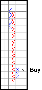
  • Hammer -- a candlestick with a long lower shadow and small real body. The shadowshould be at least twice the length of the real body, and there should be no or very littleupper shadow. The body may be either black or white, but the key is that this candlestick must occur within the context of a downtrend to be considered a hammer. The market may be "hammering" out a bottom.
  • Hanging Man -- identical in appearance to the hammer, but appears within the context of an uptrend.
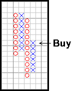
  • Engulfing Patterns -- Bullish -- when a white, real body totally covers, "engulfs" the prior day's real body. The market should be in a definable trend, not chopping around sideways. The shadows of the prior candlestick do not need to be engulfed.
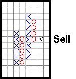
  • Bearish -- when a black, real body totally covers, "engulfs" the prior day's real body. The market should be in a definable trend, not chopping around sideways. The shadows of the prior candlestick do not need to be engulfed.
  • Dark-Cloud Cover(bearish) -- a top reversal formation where the first day of the pattern consists of a strong white, real body. The second day's price opens above the top of the upper shadow of the prior candlestick, but the close is at or near the low of the day, and well into the prior white, real body.
  • Piercing Pattern (bullish) -- opposite of the dark-cloud cover. Occurs within a downtrend. The first candlestick having a black, real body, and the second has a long, white, real body. The white day opens sharply lower, under the low of the prior black day. Then, prices close above the 50% point of the prior day's black real body.
Stars
These candlestick formations consist of a small real body that gaps away from the real body preceding it. The real body of the star should not overlap the prior real body. The color of the star is not too important, and they can occur at either tops or bottoms. Stars are the equivalent of gaps on standard bar charts.
wpe3C.jpg (9809 bytes)

Stars make up part of four separate reversal patterns:
Morning Star
Evening Star
Doji Star
Shooting Star (Inverted Hammer)
  • Morning Star -- this is a bullish bottom reversal pattern. The formation is comprised of 3 candlesticks. The first candlestick is a tall black real body followed by the second, a small real body, which gaps (opens), lower (a star pattern). The third candlestick is a white real body that moves well into the first period's black real body. This is similar to an island pattern on standard bar charts.
  • Evening Star -- a bearish top reversal pattern and counterpart to the Morning Star. Three candlesticks compose the evening star, the first being long and white. The second forms a star, followed by the third, which has a black real body that moves sharply into the first white candlestick.
  • Doji Stars -- When a doji gaps above a real body in an uptrend, or gaps under a real body in a falling market, that particular doji is called a doji star. Two popular doji stars are the evening star and the morning star.

  • Evening Doji Star -- a doji star in an uptrend followed by a long, black real body that closed well into the prior white real body. If the candlestick after the doji star is white and gapped higher, the bearishness of the doji is invalidated.
    chart19.gif (3302 bytes)
  • Morning Doji Star -- a doji star in a downtrend followed by a long, white real body that closes well into the prior black real body. If the candlestick after the doji star is black and gapped lower, the bullishness of the doji is invalidated.
  • Shooting Star -- a small real body near the lower end of the trading range, with a long upper shadow. The color of the body is not critical. Not usually considered a major reversal sign, only a warning.

  • Inverted Hammer-- not really a star, but does look like a shooting star. When occurring within a downtrend, may be a turning signal. Body color is not critical.


  • Final Thoughts and Credits

    It is important to realize that this introduction is just that, an introduction to candlestick analysis. After having read this, you will have merely scratched the surface of the many patterns and variables that can go into candlestick analysis. No attempt was made to provide a thorough analysis of each and every pattern. In fact, many formations were left out as they cross the border into more complicated analysis. For a more complete overview of candlestick analysis, it is highly recommended that you read the book that is referred to below.

    A large portion of the material in this introduction is taken from an excellent book called Japanese Candlestick Charting Techniques: A Contemporary Guide to the Ancient Investment Techniques of the Far East. In some cases, sentences were taken almost verbatim, as there was no better way to say what Mr. Steve Nison, the author, already said. In his book, Mr. Nison, completely explains candlesticks and their formations, but more importantly explains how to combine candlestick analysis with traditional technical analysis. It is highly recommended that you consider purchasing this book from the ALTAVEST Online Bookstore.
    As traders, we need as many trading tools in our arsenal, and a basic knowledge of candlesticks provides a trader much needed ammunition. Also remember that no matter what the trading tool, no matter how advanced or ancient, it is only effective when put into practice properly. This is, of course, your job as the trader.
    by Erik L. Gebhard
     
    ALTAVEST Worldwide Trading, Inc.